Colour as a Narrative Tool in Still Life Photography
In a single frame, a story unfolds. Before a viewer even registers the object, they feel its mood. That feeling is delivered almost entirely by colour. In still life photography, colour is a deliberate narrative tool, a language that speaks directly to our emotions and intellect. It can whisper elegance, shout with energy, or evoke a quiet sense of nostalgia.
For brands aiming to create imagery that truly connects, understanding how to wield this language in both an artistic and commercial context is key.
The Language of Colour in Still Life Photography
To speak of the 'language of colour' is to acknowledge its power to communicate complex ideas without a single word. Every hue, shade, and tone carries inherent meaning and association, capable of transforming the narrative of a photograph.
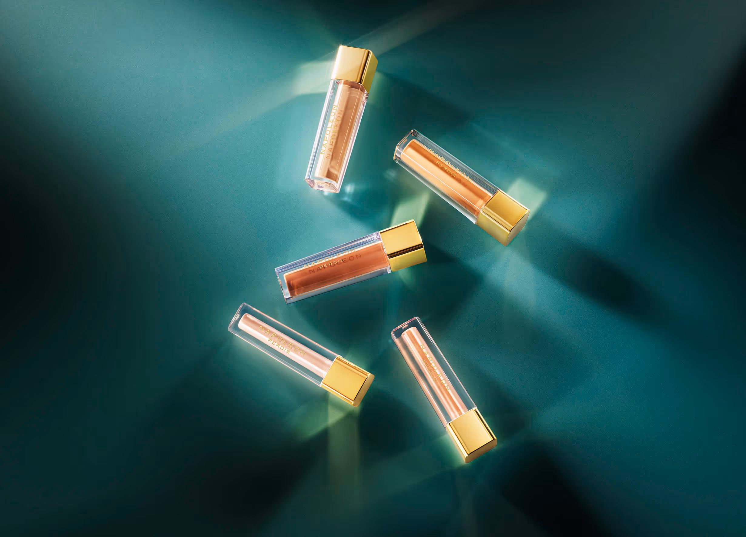
A composition featuring a single perfume bottle can feel dramatically different depending on its colour context. Set against deep navy blues and burgundy wines, it evokes an evening's allure and mystery. Place that same bottle among soft peaches, creamy whites, and pale yellows, and suddenly it conveys a story of morning light, freshness, and gentle self-care. The object hasn’t changed, but its story has been completely rewritten.
This is why brands have shifted their focus from merely showcasing objects to architecting entire colour palettes. A successful still life image is a curated world where every element, from the backdrop to the subtlest prop, contributes to a cohesive message.
The Psychology of Colour: Why It Shapes Perception
Our response to colour is deeply ingrained, a blend of psychological programming and cultural conditioning. Specific colours trigger distinct emotional and physiological responses, often subconsciously. This is the foundation of colour psychology, a critical field for any brand that communicates visually. Scarlet red can heighten the sense of urgency or passion, while sky blue calms and reassures, suggesting trustworthiness. Golds and metallics often signal prestige and luxury, while muted pastels like lavender or blush pink evoke softness, care, or well-being.
Through consistent and strategic use of colour, brands build powerful subconscious associations. Think of the forest green of an eco-conscious wellness brand, or the bright orange of a creative tech startup. These decisions are deliberate, carefully aligned to a brand’s core values and the emotions they want to evoke. Over time, this consistency creates a visual signature that is instantly recognisable and emotionally resonant.
Understanding this link enables a photographer to craft images that not only display a product but also reinforce the brand’s entire emotional ecosystem. Lighting, too, can amplify this impact. With high-key brightness lifting pale yellows into optimism, or low-key shadow play turning charcoal greys into an atmosphere of drama and sophistication.
Brand Identity Through Colour Palettes
A brand's colour palette is its visual uniform. Consistent use of a specific set of colours does more than make a brand recognisable. It builds a coherent identity that communicates its personality at a glance. When a consumer sees a specific combination of muted neutrals and soft metallics, they might instantly think of a luxury lifestyle brand known for its minimalist elegance. Conversely, a palette of clashing, vibrant primary colours signals a brand that is youthful, dynamic, and unafraid to be bold.
This colour palette becomes a visual shorthand for the brand's entire ethos. It is a promise of a certain experience, whether that's the calm reliability of earthy tones or the exciting innovation of electric hues. An effective colour strategy must be integrated into every visual touchpoint, from campaign photography to packaging and social media.
In still life photography, this means every composition is an opportunity to reinforce that identity. The choice to use a desaturated, monochromatic scheme or a richly saturated, analogous one is a strategic decision that speaks volumes about the brand’s values long before the product itself is considered.
Seasonal Colour Trends in Still Life Photography
The visual world, particularly in fashion and lifestyle, moves in cycles, and colour trends are a significant part of that rhythm. Looking at trends, we see a continued appreciation for both nature-inspired palettes, such as deep moss greens and terracotta. Acknowledging these trends can be a powerful way for a brand to signal its relevance and contemporary edge. Incorporating a trending colour into a campaign can capture immediate attention and align the brand with the current cultural conversation.
However, chasing trends must be balanced with brand integrity. A brand built on a classic, timeless identity might look out of place, suddenly adopting a fleeting neon palette. A brand can nod to a seasonal trend through subtle props or background textures while keeping its core brand colours dominant.
For example, a heritage brand might introduce a trending lavender hue as a secondary element in a spring campaign, adding a touch of modern freshness without abandoning its foundational navy and cream.
Staying updated requires a keen eye on fashion runways, design publications, and cultural shifts, allowing photographers and art directors to advise clients on when to embrace a trend and when to remain steadfast in their classic visual identity.
Colour as an Emotional Anchor in Campaigns
Within a photographic campaign, colour functions as an emotional anchor, immediately establishing the mood and tone before any other detail is absorbed. It’s the first layer of the story. Warm tones, like reds, oranges, and yellows, tend to feel inviting, energetic, and intimate. They pull the viewer in.
Cool tones, your blues, greens, purples, create a sense of calm, spaciousness, and sophistication. They can feel more distant and ethereal. A skilled photographer uses this knowledge to guide the viewer’s perception from the outset.
Colour also directs the viewer’s focus. A single splash of vibrant colour in an otherwise neutral scene will instantly draw the eye, highlighting a key feature of the product or a crucial narrative element. This technique is essential in still life, where the composition is meticulously controlled.
Practical Tips for Brands Choosing Colour in Still Life
Briefing a photographer on a concept-led still life shoot requires clear communication about colour. To ensure the final images align perfectly with your brand's narrative, it's vital to move beyond vague descriptions and provide a defined colour direction. Here’s a practical approach for brands to get the colours right:
- Start with the Story: Before picking a single colour, define the feeling you want to evoke. Is it calm luxury, vibrant energy, or minimalist purity? This core emotion will guide your palette.
- Ask Key Questions: When considering a colour, ask: 'What story does this colour tell?' and 'Does it align with my brand’s core values?' A beautiful colour that contradicts your brand message will create visual dissonance.
- Build a Palette, Not Just a Colour: Provide your photographer with a palette of 3-5 complementary colours. This includes primary, secondary, and accent colours. This gives them a clear framework while allowing for creative interpretation within the composition.
- Balance the Elements: Discuss how the product's own colours will interact with backdrops and props. If your product is brightly coloured, a neutral background might be best to make it the hero. If the product is neutral, colourful props can inject personality and context. The goal is harmony, not competition.
- Test and Refine: Tools like Adobe Color or Coolors can help you build and visualise palettes. Don’t be afraid to test combinations. A common challenge is a colour looking different under studio lighting. This is where an experienced photographer’s technical skill becomes invaluable, as they can manipulate light to ensure colours render true to the brand’s vision.
Elevating Brand Storytelling with Colour
Ultimately, colour in still life photography is the invisible thread that weaves a product, a mood, and a brand identity into a single, compelling narrative. It is a strategic choice that elevates a simple image into a piece of visual storytelling that can stop the scroll, evoke desire, and build a lasting brand connection. Going beyond mere aesthetics to harness the psychological and emotional power of colour is what separates forgettable product shots from iconic, crafted photography. It transforms an object from something you see into something you feel.
If you're ready to tell your product's story with the depth and intention it deserves, let’s create still life imagery that resonates. Contact Edward Urrutia to craft meticulously constructed photos with precisely the right colours to bring your brand narrative to life.